Chat Widget & Settings
UX Design, UI Design, Usability Testing, User Interview
We received feedback from the sales team and shared a mission to refine the user experience of the chat widget. We launched a new feature with the MVP approach that helped improve click rate and engage customers more effectively.
01 – User Interview
Interviewing the sales team has provided us with much client feedback. We could find the pain points and problems quickly – the chat widget was not prominent enough to make website visitors recognize it, leading to low usage and customer engagement.
02 – Chat Widget Color
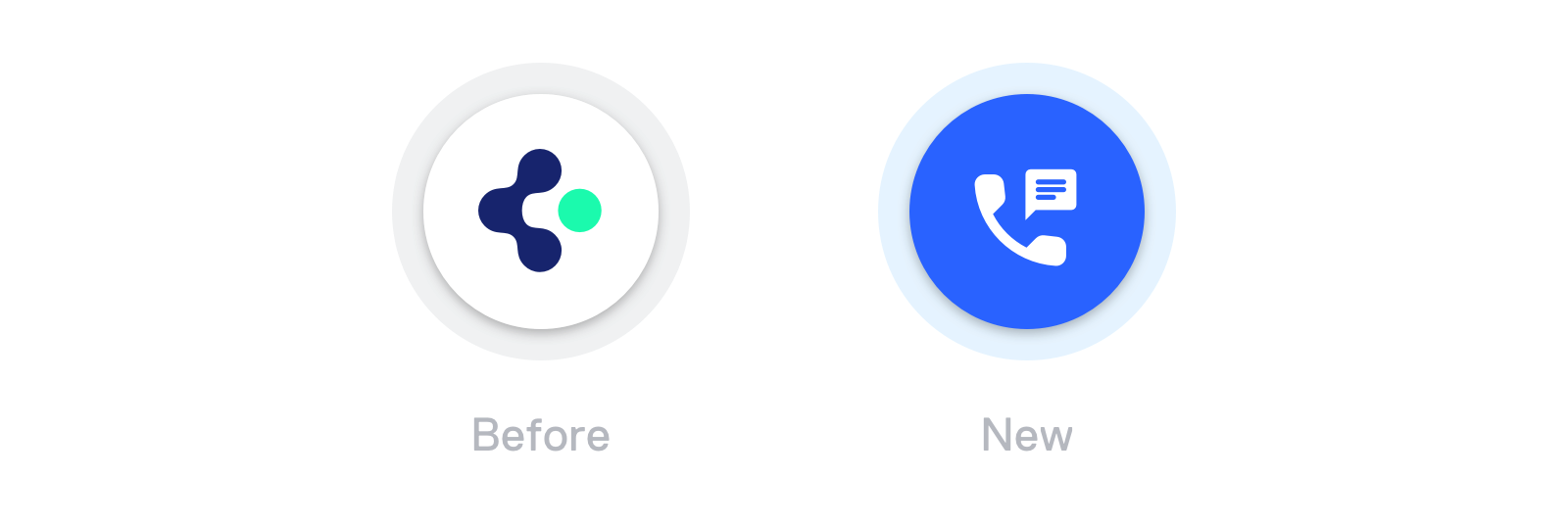
We first changed the widget color from white to blue because it is the common color used on other communication platforms like Facebook Messenger and Intercom.
Replaced the brand logo with a generic icon was a practical choice representing the widget's function intuitively.
03 – Smart Greeting
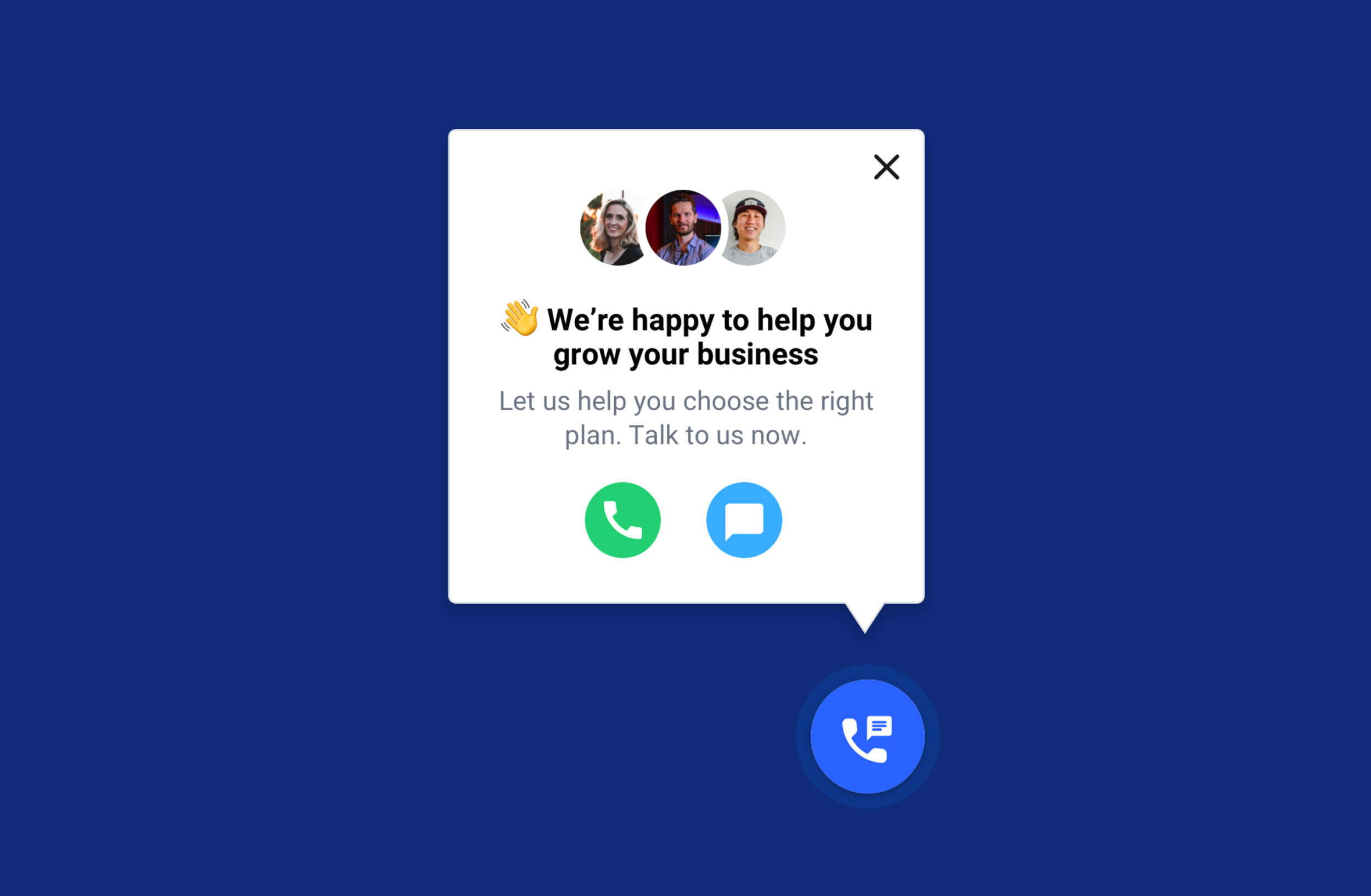
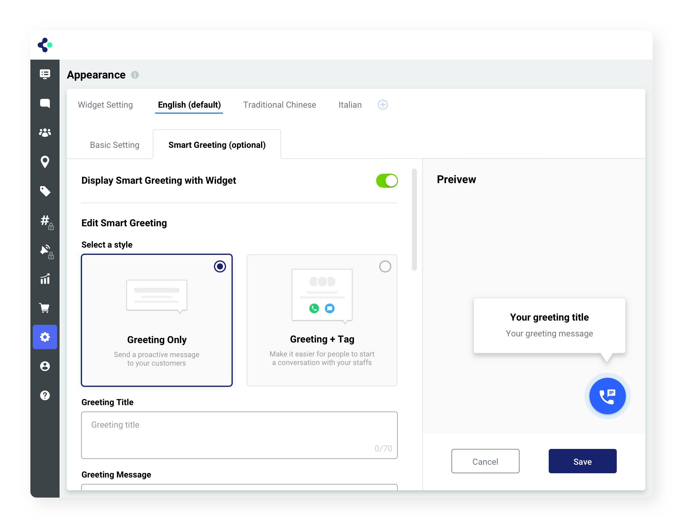
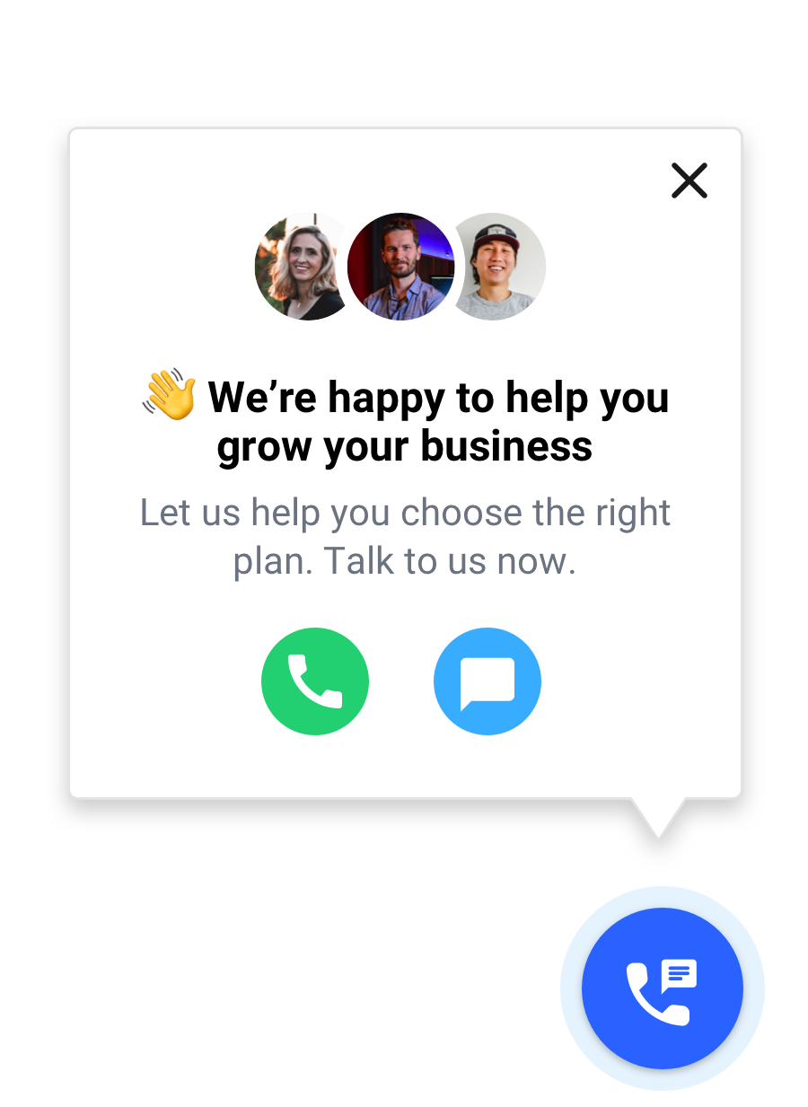
My team did desk research, then ran a little rapid ideation time with the sales team. We came up with the direction of “smart greeting” – a prompt message popping out from the top left of the chat widget, based on the criteria being triggered. 2 styles of smart greetings were finalized in this phase.
Style 1 – “Say hello”
A short message with a CTA button that links to another webpage.
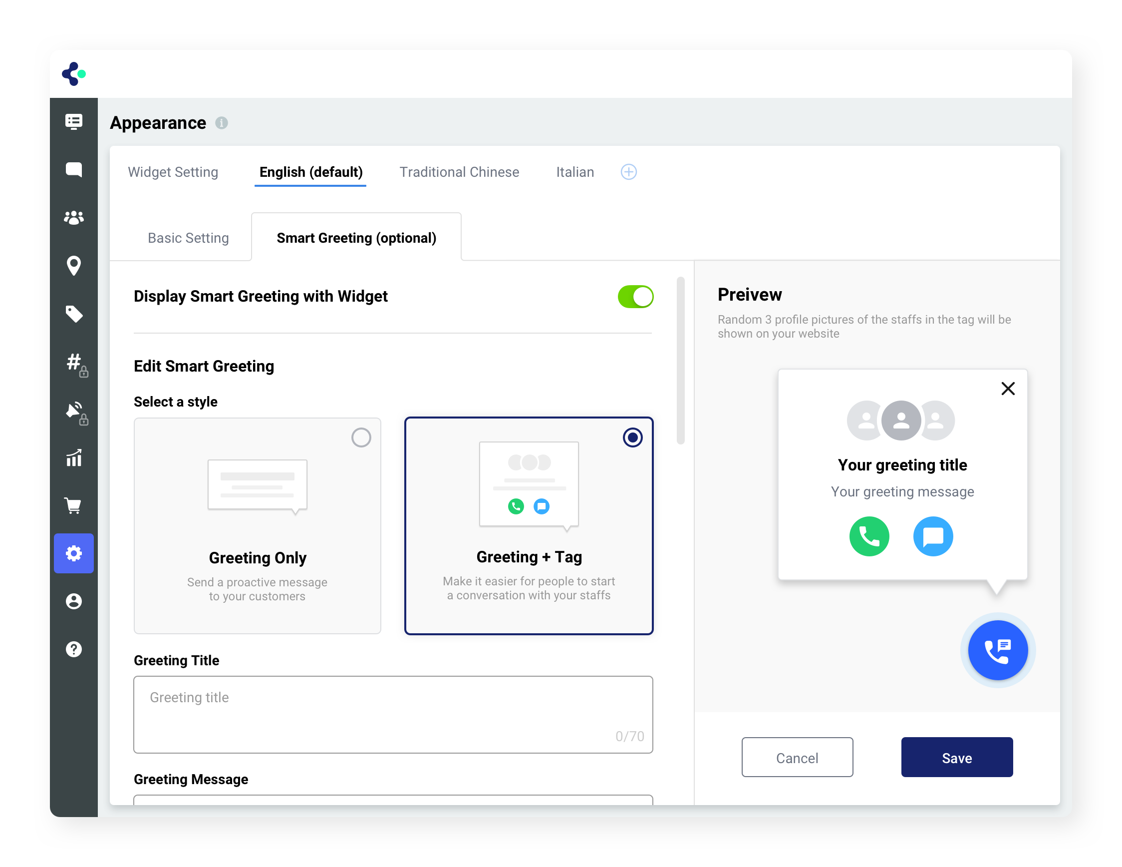
Style 2 – “Test it out”
A longer message with actionable buttons and profile pictures that bring a human touch.

04 – Dashboard Settings
We decided to offer the Admin role only 1 Smart Greeting for each widget language. We used a toggle switch because the Admin can only turn on/off and edit 1 Smart Greeting but can’t add more in this phase. The Preview section will be defined by the toggle switch (on/off), and the list of Settings will be shown after the Admin turns on the Smart Greeting.

